

React in Outlook? How we built the Weekly Indicators Summary
Email has always lagged behind the browser in terms of features and capabilities. While in the latest version of Chrome or Firefox you can play console-quality games, make music, and share your screen, email is a very different story. Getting a layout to look consistent across devices or sharing the joy of an animated GIF are things we take for granted on the web, but can be frustrating to deliver to your inbox.
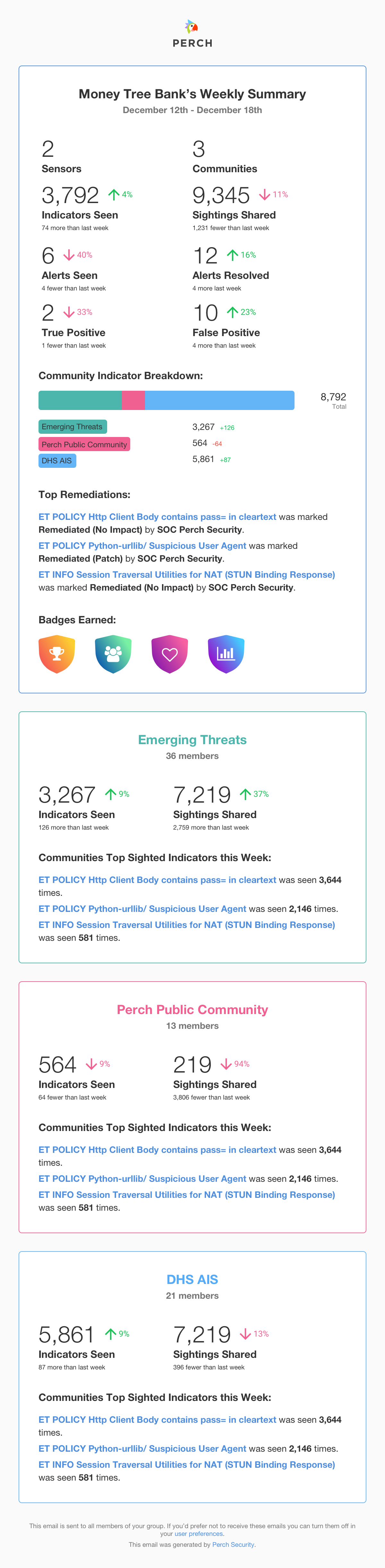
Weekly Summary emails
If you use Perch, you’ve probably gotten one of our new Weekly Summary emails by now. For everyone else, they look a little something like this. Our emails have always had a lot of information, but as our customers have had more sightings, alerts, and intel, it can start to feel overwhelming. Chances are pretty good your inbox doesn’t need any heft added to it, so when redesigning the Weekly Summary we wanted to help our customers get as much insight as they could with as succinct an email as possible. By highlighting trends and counts in colorful charts at the top of the email, we think the Weekly Summary gives you more actionable information faster than ever before.
Testing the limits of email
Those charts are a key part of the new design, but charting in email has been avoided by many a dev team. There are some “hacks” you can do to sprinkle some data-viz magic into your emails but often times they aren’t pretty or scalable.
If you have a single chart to send (and time on your hands), you could try making a static copy of the chart in a design program like Sketch or Photoshop and saving it as an image to include in the email. But with a flock of customers and billions of data points that change by the minute, that won’t work here.
In previous Perch emails we have create simple bar charts with css but every email client has slightly different support and the code gets messy fast. No one wants to maintain a Rube Goldberg machine, especially one made of CSS.
With the Perch product, we use React and Recharts to create beautiful, reusable charts with live data for each customer. We can’t use this approach in our emails though because most email programs will not allow us to execute Javascript. This means no React, no Recharts, and no real-time chart goodness.
Leaning on the community
Our dev team did some head-scratching, white-boarding, and forum-surfing before we found repng. Repng is a Javascript library that allows you to convert any React component (like a LineChart from Recharts) into a PNG. So now, we can reuse the same charts we know and love from Perch in our emails with just a dash of CLI magic. Running the process on a Node.js micro-service, we can easily pass all the data we need for the Weekly Summary to the chart-to-png service, generate the email-friendly graphic, and send the email out the door with 100% more visual goodness.
Show me teh codez
Want to add some charts to your emails? Here’s a quick starter that will get you going in the right direction.
Start by grabbing node and npm if you don’t have them already.
We need to install all of our dependencies first:
npm install react react-dom recharts repng express bodyparser
Then we can set up out express server to listen for incoming data:
const bodyParser = require('body-parser');
const express = require('express');
const React = require('react');
const { LineChart } = require('recharts');
const repng = require('repng');

const app = express();
const port = 8080;

// Add middleware for reading JSON bodies
app.use(bodyParser.json());

// <LineChart width={500} height={300} data={data}> ... </LineChart>
// This is the JSX you may be more familiar with,
// but for the sake of not dragging babel into this
// we will use the "vanilla JS" flavor of react in this snippet.

// Note: "data" should be an array of objects that have an:
// amt: Number | name: String | pv: Number | uv: Number

const chart = props =>
  React.createElement(
    LineChart,
    { data: props.data, height: props.height, width: props.width },
    React.createElement(XAxis, { dataKey: "name" }),
    React.createElement(YAxis, null),
    React.createElement(CartesianGrid, { stroke: "#eee", strokeDasharray: "5 5" }),
    React.createElement(Line, { type: "monotone", dataKey: "uv", stroke: "#8884d8" }),
    React.createElement(Line, { type: "monotone", dataKey: "pv", stroke: "#82ca9d" })
  );

// Add routes
app.post('/convert-chart-to-png', (req, res) => {
  repng(chart, {
    width: req.body.width,
    height: req.body.height,
    props: req.body
  })
  .then(streams => {
    const [ pngData ] = streams;
    pngData.pipe(res);
  });
});

// Start the server
app.listen(port, () => console.log(`Running on port ${port}`));
In your terminal of choice, cd your way to the project folder and run node index.js (or whatever you named your file) and your server should echo “Running on port 8080”.
Now you can POST some chart data to localhost:8080/convert-chart-to-png and get base64 image data in the response!
Obviously this code is not production-ready, but hopefully it can inspire you to do something cool with React and repng - it doesn’t even have to be a chart. You could just as easily pass any react component so why limit yourself?
Wrapping up
We hope to use this technique to bring more of what our customers love about the Perch web app directly to their inbox.
You know what they say: an image is worth a thousand words, but a chart is worth a billion data points - or something like that.
We'd love to hear your thoughts. Find us on Twitter, LinkedIn or write in to hello@perchsecurity.com
Next: Supercharge your SOC: 3 security playbook ideas with the Perch API
Share this on: Subscribe to our blog